

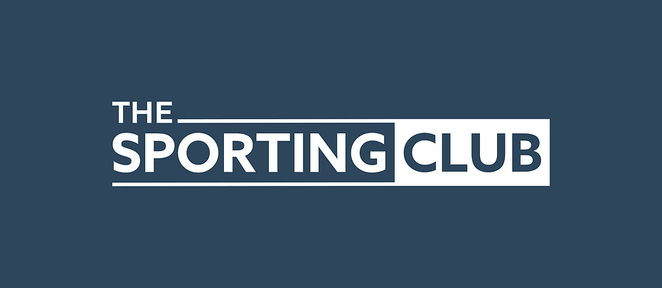
THE SPORTING CLUB
The Sporting Club is a national business network with permanent venues across the UK for sport lovers. As an established business, my client wanted to refresh and strengthen their brand identity but not move too far away from the existing logo, so my brief was to take what they had and refine it into a new refreshed logo. In addition to this I explored colour and created a new colour palette and font for them to use in their comms.
Service
Brand Identity & Asset Creation
Client
Business
The Sporting Club
Members Networking Club

THE LOGO
& BRAND ASSETS
The brief was to refresh and strengthen their brand identity but not move too far away from the exiting logo, so my approach was to look at font, colour, alignment and spacing within the current design as well as ways to help give the logo standout when its featured alongside other logos, which it often is at events. The colour of the logo is softened by moving away from solid black to a very dark blue/black colour.
As part of the logo development, I also developed a new colour palette and suggested brand font to use consistently within all communications. All assets were supplied along with Brand Asset Guidelines.
